Portway App
UI / UX Design
BonkeyBong

Summary
—
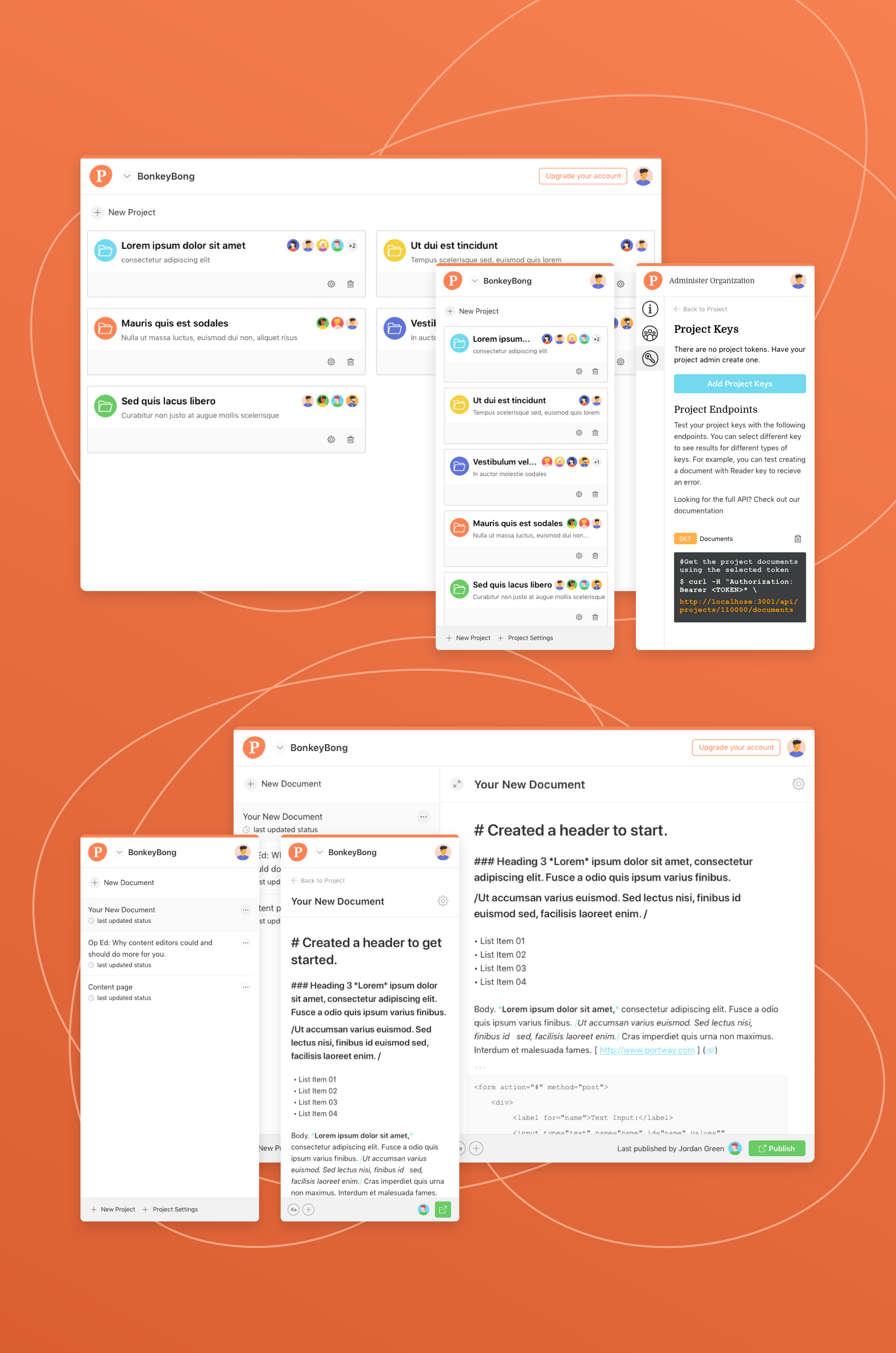
Portway is a notes app for developers. Conceived and built by developers, I was approached to brand and clean up the Interface of the app.
To start, I inventoried the current app to understand the structure and user goals. Along the way I noted areas to improve the user experience, such as restructuring the adding of a new section to a document, clearer iconography, and responsive design throughout. My critique was that the UI was clean, but also ungrounded and illegible at times. Color was used sparingly, but often confused the hierarchy.
The goals of the product owners was to keep the clean look of the app, and maintain the minimal clicks to get to different pages of the app. With a new branded base kit of clean typography, basic colors, and newly designed line icons I was able to give the app new life and a base for the entire structure to build from.